
preface
Year : 2026
My role: Visual/Web Designer
Tools: Figma, Jitter
My role: Design direction (End-to-end)
Tools: Figma, Jitter
My role: Visual/Web Designer
Tools: Figma, Jitter
Live at: www.chroniclehq.com
The last launch from update was around August 2025 so naturally the product had grown so much that we wanted to make a proper launch again. We named it Chronicle 2.0
Context
We launched our product to the world, and it had been almost 6 months since in January 2026. The team just returned form a long holiday and everyone was excited to make a new product launch. This time, we were launching Chronicle's AI capabilities along with numerous other features to the whole world. So, naturally we needed a new website that spoke a new design language for the newest group of users. Let's dive into the story in depth.
My role: Visual/Web Designer
Tools: Figma, Jitter
Background
The old site was built for the audience that "finds you" first. It was product centric, dark, and spoke a of the twitter "tech-bro" design language. That is not a bad direction, but it was just not the one our buyers spoke.
The users we wanted were profoundly in B2B space. An enterprise buyer arrives with different questions than a launch-day tech-bro. They are not browsing for something clever or fancy. They want to know what the product does, how much ROI can the product make if they buy-in, whether it does exactly or better, more than what their current presentation tool does and whether the company behind it worth putting on a procurement list. The old site answered none of those exactly.
So the revamp had two jobs: drive signups, and make Chronicle look like a trustworthy product an enterprise buyer could bring to their team.
My role: Visual/Web Designer
Tools: Figma, Jitter
My Design choices
One principle drove everything else for me.
Show the feature, without "over-explaining" it. A visitor should understand what something does at a glance (3 second rule), without reading a paragraph or decoding a screenshot. Product screenshots are dense and need captions, lists need patience. Neither survives a quick 3-sec skim through (native user psychology).
Everything else followed the rule from making the site legible and credible for the reader:
Light mode over dark. The dark site was giving "tool for builders". Light mode signals a tool for work/enterprise.
Abstracted UI over raw unprocessed screenshots. Strip the interface down to the one idea the visitor needs to take away instantly.
Warm, real-world imagery. Presentations get made by people for rooms full of people. The imagery should say that visually.
Near-sharp corners and a sans-heavy type system. Serious and authoritative, not playful.
My role: Visual/Web Designer
Tools: Figma, Jitter
Visual Concepts
Explaining "Start from anywhere" in one glance.
My role: Visual/Web Designer
Tools: Figma, Jitter
The problem: File import reads as a boring bullet point. A screenshot of the upload flow would have needed a caption, and by then the visitor has already scrolled away.
What I did: An abstracted UI where a cursor drags two files into the product's chat interface, and a deck starts forming from them.
Why those two files: PPT and PDF, chosen deliberately. PPT export was one of our biggest moat for the launch, so leading with it showed our advantage without a single line of copy. Both PPT and PDF signals to a B2B viewer that their actual working data has a path into this product.
My role: Visual/Web Designer
Tools: Figma, Jitter

A hero section that proves the claim instead of making one
My role: Visual/Web Designer
Tools: Figma, Jitter
The problem. Every AI tool launching every week on product hunt promised the same thing. "AI native" had become a phrase that raised suspicion rather than interest. The claim could not carry the hero on its own.
What we did. A bold headline on the left saying "AI presentations with the slop", and on the right a replica of the Chronicle interface cycling through real decks from the product, categorised by use cases.
Why. The headline names the objection directly and the right side settles it in the same screen. The categories do a second job. A visitor is not evaluating a generic tool, they are looking for the specific thing they have to make on Monday, and one of those six labels is usually it. Sorting output by use case rather than by visual style was a deliberate decision, and it traces straight back to the positioning problem.
My role: Visual/Web Designer
Tools: Figma, Jitter

Making it timeless
The site ships as custom React on a WordPress backend, designed with Figma. I built the tokens, components, sections, cards, photography treatment, abstracted UIs and motion, and planned the build with a freelance developer.
The page templates are live in WordPress, which means the growth team ships new pages by updating content. No designer or developer needed in that loop.
My role: Visual/Web Designer
Tools: Figma, Jitter

Cross roads
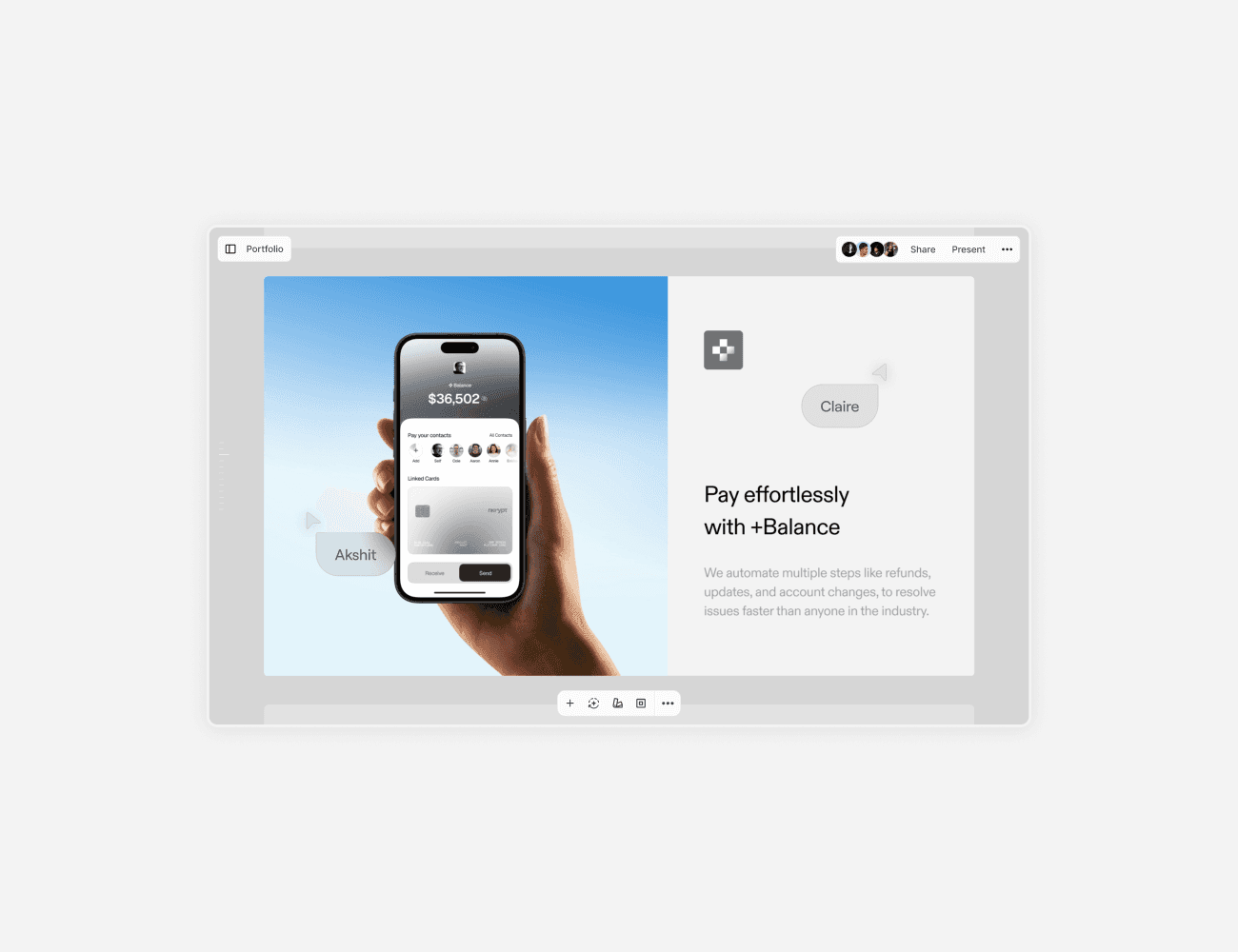
I wanted to push a little further. More white spaces, larger typography, but the same muted palette, closer to the kind of restraint that reads as confidence.
But, I decided to not push forward. Not because the direction was wrong, but restraint asks the visitor to do interpretive work, and the audience was not there to interpret. They needed legibility and trust before they needed elegance. The version that shipped is more grounded than the version in my head, and for the buyer it was aimed at, that was the right trade.
My role: Visual/Web Designer
Tools: Figma, Jitter

Outcomes
The site was the landing surface for a launch that finished #2 Product of the Day and #1 Product of the Month on Product Hunt. The ranking belongs to the product and the launch as a whole, but this was the page every one of those visitors landed on.
My role: Visual/Web Designer
Tools: Figma, Jitter
We started getting more B2B license enquiries post our launch day. Most of them didn't have primitive enquiries, like what is chronicle. Rather, they asked questions like "Can Chronicle adapt to our existing style of presentation decks using AI". That showed that people have enough idea about Chronicle to ask deeper questions, which helped our growth lead Renee adapt to these enquiries and propose suitable plans for their uses.
My role: Visual/Web Designer
Tools: Figma, Jitter
The website was also featured on Refero Styles.
Check here styles.refero.design/style/1c60b014-473b-443b-b0f5-220612feebb7
My role: Visual/Web Designer
Tools: Figma, Jitter

closing notes
Working on this site was a great experience in itself. There were lots of learning and unlearning that happened throughout the project. But most importantly for me, the success of a site doesn't lie in metrics or data, it's measured with how soulful the process was. As long as I am expressing art through design, nothing else matters.
My role: Visual/Web Designer
Tools: Figma, Jitter
credits
Engineering: Moreno Di Domenico
Copywriting: Renee Zhang