preface
Year : 2026
My role: Visual/Web Designer
Tools: Figma, Jitter
My role: Design Direction & UI Designer
Tools: Figma
My role: Visual/Web Designer
Tools: Figma, Jitter
context
Still is a daily breathwork app rooted in Indian values of pranayama and yoga. The core idea of the app is for you to practise breathing exercises everyday and take away a soulful experience of calmness at the end of each session.
My role: Visual/Web Designer
Tools: Figma, Jitter
Still's founder Aastha has been practising and teaching pranayama and yoga for almost a decade. She wrote "Yoga has spread across the world, which is beautiful. But along the way, the practice has been watered down, rebranded, and made more palatable for a market that values variety over depth." Hence, she wanted to build something that respects the depth of the practices as well as being approachable for everyone to use.
My role: Visual/Web Designer
Tools: Figma, Jitter
Still's brand
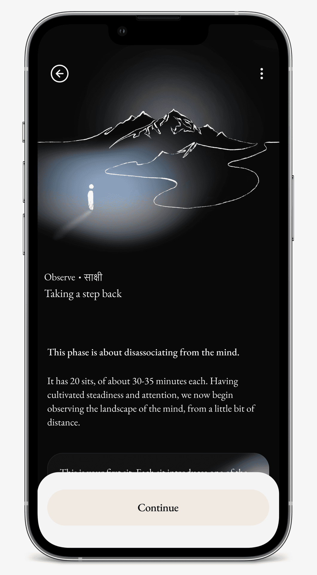
Still's core brand revolves around the stillness someone achieves after a soulful practice session. This is divided into phases called the "still path" consisting of begin, centre, focus, observe, deep dive, and at the end stillness.
My role: Visual/Web Designer
Tools: Figma, Jitter
Each stage of stillness actually describes how someone starting breathwork for the first time feels while actively practising those sessions. The first phase is usually the easier path with an average time of 10minutes of practise. Similarly each phase increases the level of difficulty and the length of each breathwork session.
My role: Visual/Web Designer
Tools: Figma, Jitter
need for re-design
Still was not a new app. There has been a still app for it's users ever since I've known Aastha which is around 2023. But, the app had reached it's maximum churning point. The existing flows were confusing and the hierarchy of each component being used added more clutter than being helpful.
My role: Visual/Web Designer
Tools: Figma, Jitter

My goal was to rethink the entire app design from a new lens, constructively evaluate which element and tokens are needed and which shall be let go. When Aastha was creating the still journey, she had collaborated with Jenny who creates illustrations for each path individually.
My role: Visual/Web Designer
Tools: Figma, Jitter

This gave us a ground to start designing the interface of the app from this here. The illustrations became the core identity of each path.
My role: Visual/Web Designer
Tools: Figma, Jitter

Flows
Designing the user flows and the screens with respect that was easy. I have been a still user after my cancer treatment. I knew exactly where the pain points were since I had used the app proactively everyday. I took my learning and built upon it, while asking the questions that a normal Still user will get during each step of the process.
My role: Visual/Web Designer
Tools: Figma, Jitter
Design system
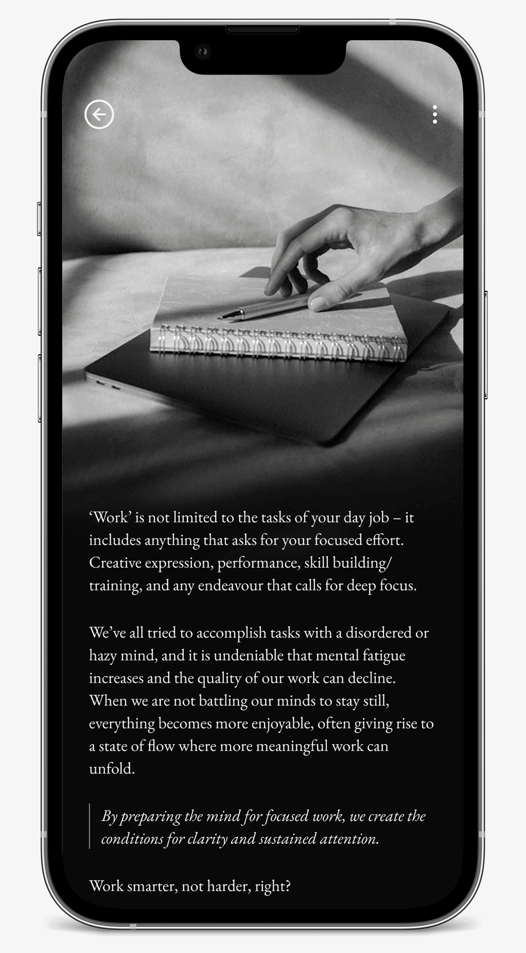
The color system was carried over from Still's original brand work. The interface theme was decide to be kept dark because light mode background is too stimulating and many still users practised breathwork before going to bed, so having a dark mode makes more sense because no one wanted to get stunned like the ash baby at the darkest hour of the day.
My role: Visual/Web Designer
Tools: Figma, Jitter
Extra explorations
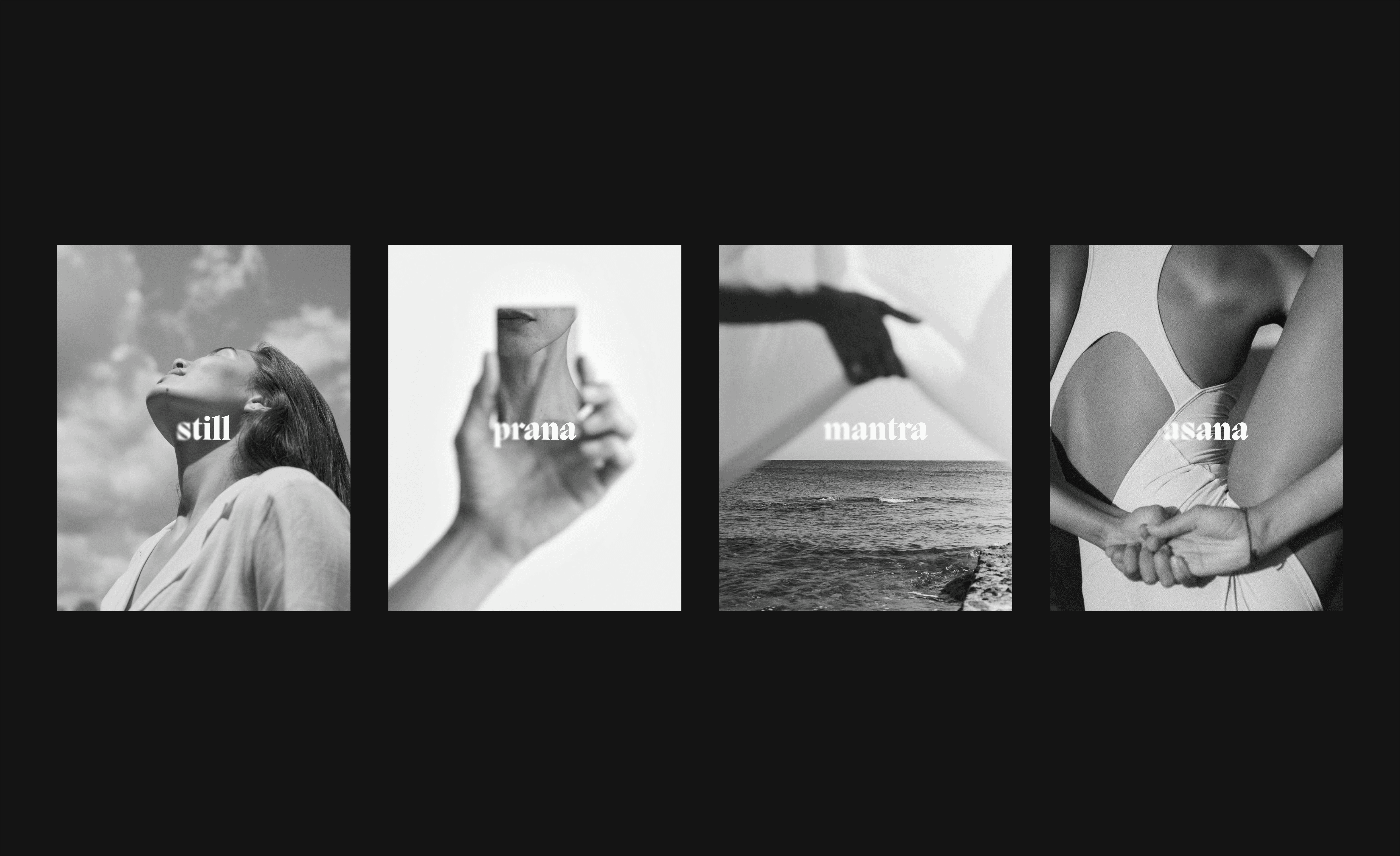
We also briefly explored on what Still's brand could look like if we did an overhaul. The idea was to integrate the still path to a new brand system including logos, icons and photogrpahy to match the new sentiment.
My role: Visual/Web Designer
Tools: Figma, Jitter